Although they’re wildly popular, there’s still quite a bit people don’t know about subway tiles. They’re classic, functional, and work in interiors of all kinds, but did you know that they first showed up underground? In New York City’s subway system, to be exact.
When the subway opened in 1904, the NY-based architectural firm Heins & LaFarge was issued a challenging task. They needed to create a surface that was not just easy to clean but would also offer first-time passengers a familiar environment that would help put them at ease.
Their solution was what we now know as a subway tile, a thin slab of baked clay or other material with slightly curved edges and a glossy finish. This product helped subway stations look bright, polished, and sanitary even over prolonged periods.
Subway tiles rose out of the Victorian obsession with cleanliness and hygiene. Because of their glazed finish, they are easy to wash, reflect light, and are stain resistant. They’ve earned a reputation for being sanitary and utilitarian and have gone on to become a wall covering of choice for everything from bathrooms to butcher shops!
If you need inspiration for your bathroom, and kitchen take a look at the many different patterns you can create using these tiles.
Chevron
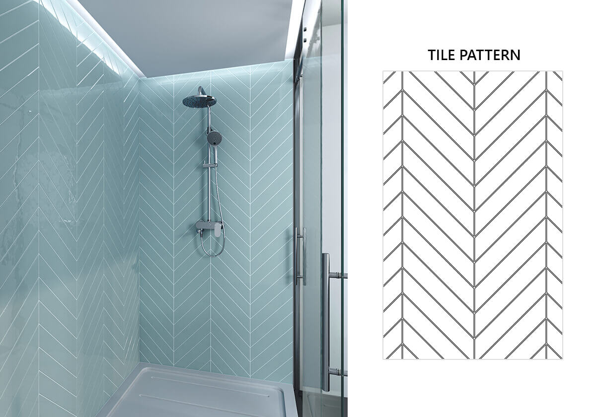
The chevron tile pattern can breathe new life into a room. It’s a younger, more spontaneous sibling to the classic herringbone design. The chevron tile takes the standard rectangle shape of the latter and tilts it.
Interlocking parallelograms make up this tile pattern, joined end-to-end and creating a smooth zigzag that can run parallel or at a right angle to the floor or adjoining walls.
Crosshatch
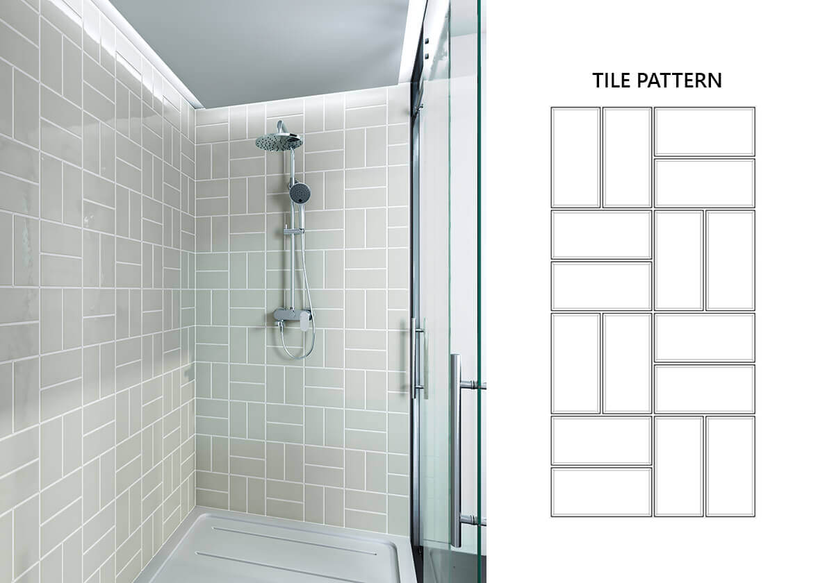
Also known as basket weave, the crosshatch tile pattern can create a fabulous focal point on its own. But you could also play with the colour contrast between the grout and the tile. The classic motif is indicated here, with squares made up of two tiles each, creating an exceptional geometric look.
Crosshatch Offset
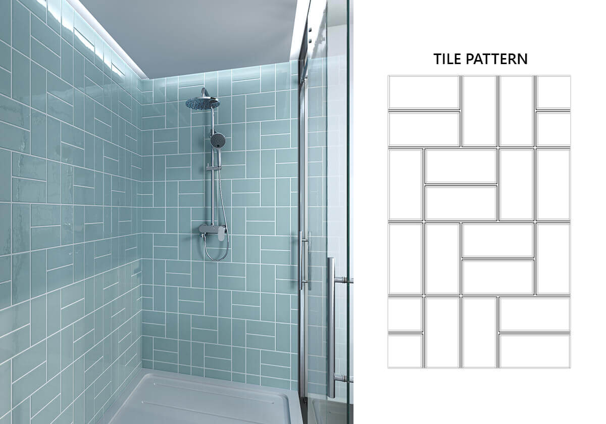
The crosshatch offset pattern mixes things up a little, alternating the horizontal and vertical stacked lines. All this means is that you’re making the grid pattern slightly more complicated. It is a fantastic way to create a more modern look for the area you’re tiling and works particularly well in a small bathroom where you want to create an illusion of space.
Crosshatch Diagonal
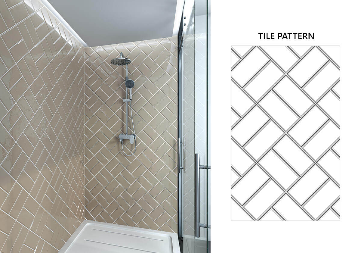
Play around with the classic crosshatch subway tile pattern by making things a little more diagonal. You’ll still be stacking them like bricks but rotated at a 45° angle. This twist adds an element of surprise because it’s unique and unexpected and it’s an excellent way to expand your bathroom or shower while keeping things classic.
Crosshatch Horizontal
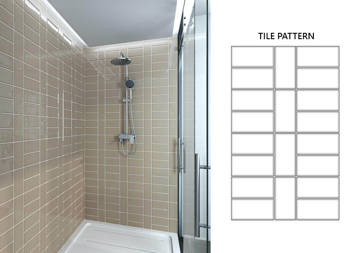
Pulled straight from the NYC subway, this classic pattern is one of the most popular ways to stack tiles. If you’re feeling experimental, why not try choosing different colours, like a sophisticated beige, or mixing finishes like satin and gloss with bold grouting? It’s an elegant, timeless look that will create the illusion of movement through your space.
Crosshatch Stack
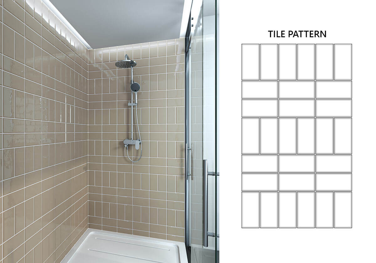
A vertically stacked layout makes ceilings feel higher than they are, and a horizontal arrangement offers widening capabilities. When you combine these in the crosshatch stack, you’re offsetting each row. It’s a wonderfully modern look and will really pop in a bathroom. This is especially true for smaller spaces.
Crosshatch Variation1

The first crosshatch variation will lengthen a room with its two vertical tiles laid atop a single horizontal one. You’ll be able to add a feeling of height as well as width with this pattern, which is ideal for areas that tend to be more confined, like showers.
Crosshatch Variation2
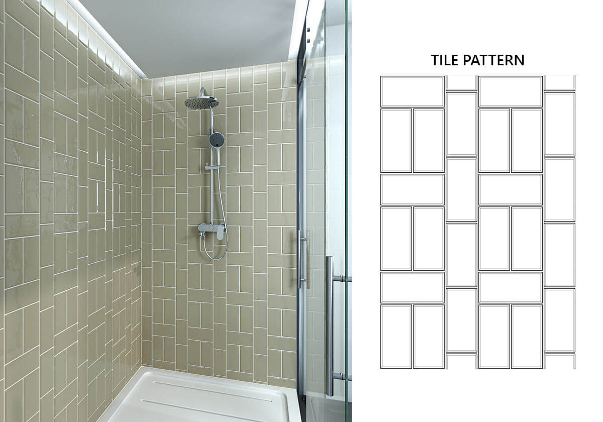
The second crosshatch variation adds a line of vertical tiles between the two vertical tiles laid atop the single horizontal one. This increases its heightening effect and will trick the eye into making you see the space as taller than it is. The irregular pattern of this variation works to make the wall more dynamic and injects a certain fluidity.
Crosshatch Vertical

These tiles feature two verticals atop one horizontal but all in perfect symmetry. This counterbalance delivers a vertical basket weaving pattern and can make ceilings feel taller. It’s ideal for areas behind your countertops and basins, and in showers. And the fact that the tiles clean so easily means you won’t be tasked with constant laborious washing.
Dashed Horizontal
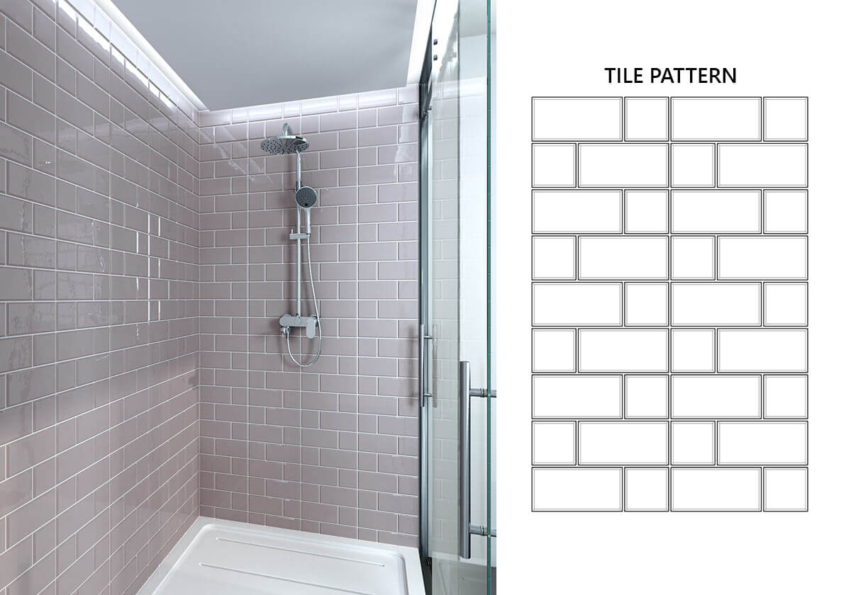
The dashed horizontal tile pattern is all about colour and proportion. This grid-like visual features a methodical, changing rectangle composition that interests the eye and makes a space more compelling. This combination is a dynamic one which offers just the right amount of rhythm and movement in a confined room like a shower or bathroom.
Dashed Variation
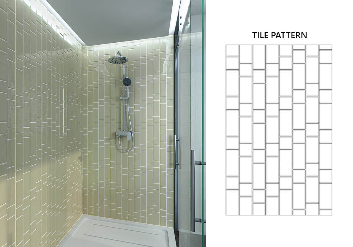
As crazy as it sounds, tilting the tiles diagonally can make a small bathroom look bigger. The brain gets tricked with this layout, so we view the room as larger than it actually is. It’s a great idea when you’re limited in terms of wall area or have a small bathroom where you want to add a feeling of spaciousness.
Dashed Variation Diagonal
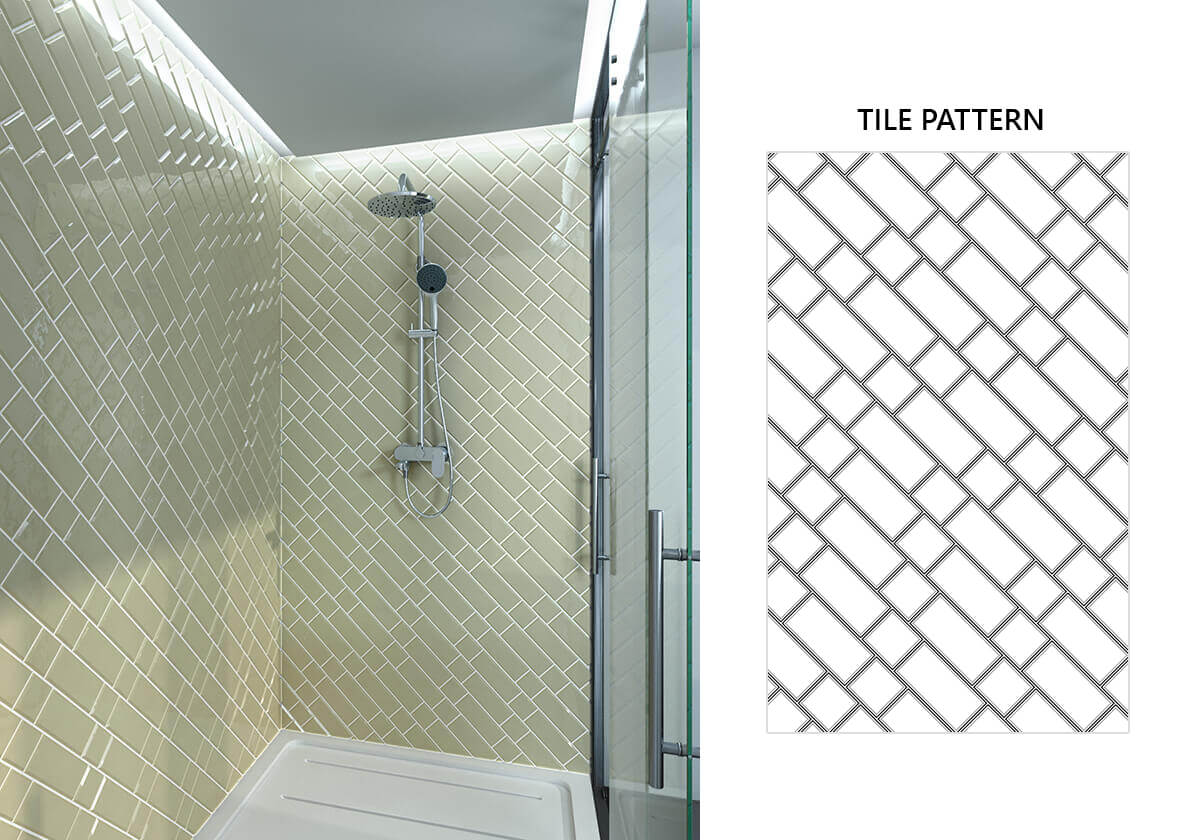
In this pattern, the dash design is offset, with the borders of the tiles not quite matching up. It’s a busy pattern, which is why it works so wonderfully in a lighter coloured tile. It adds a bit of fun to your bathroom or shower area and is ideal for a more contemporary look.
Dashed Vertical
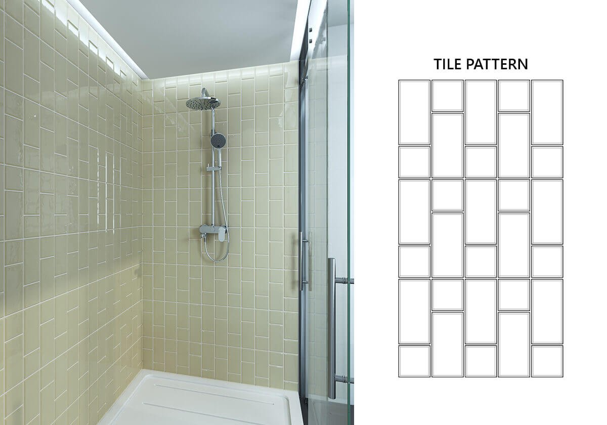
Another variation of the dashed vertical subway pattern offsets the straight tiles. Once again, it’s a perfect design for areas with a low ceiling and you can spice things up by playing around with the grout. It’s a fantastic option when you’ve got a lot of floor space but not so much wall.
Flemish Bond

These tiles are perfect for fans of the running brick layout but who want something with a little more kick in terms of visual aesthetics. It gives you all the look and feel of the quintessential design but with a tiny spin that will ensure it pops.
Flemish Bond Vertical
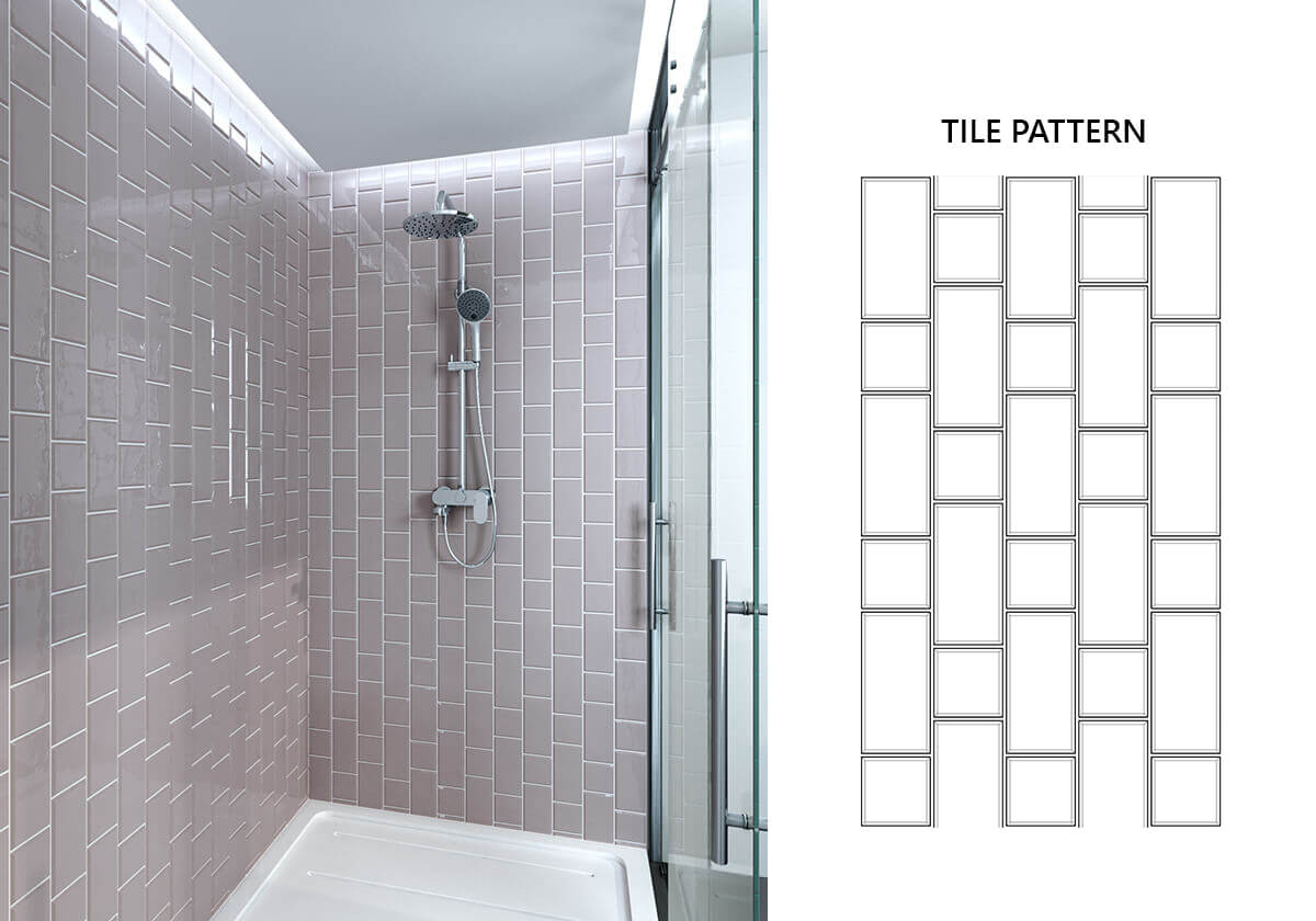
Instead of the standard Flemish Bond pattern, you can opt for the vertical variation. The upright mix of square and rectangular tiles will emulate an instantly recognisable brick pattern and bring a little of the outside in. This kind of subtle architectural motif is perfect for a featured space on your bathroom wall.
Herringbone Diagonal
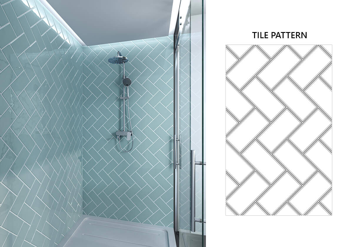
This is a great pattern for fans of classic styles who want something a bit fresher. The tiles being placed diagonally create a very modern pattern, making any wall stand out and working brilliantly as an accent to your bathroom as a whole. Another thing that recommends it is that it’s probably never going to go out of style!
Herringbone Elongated
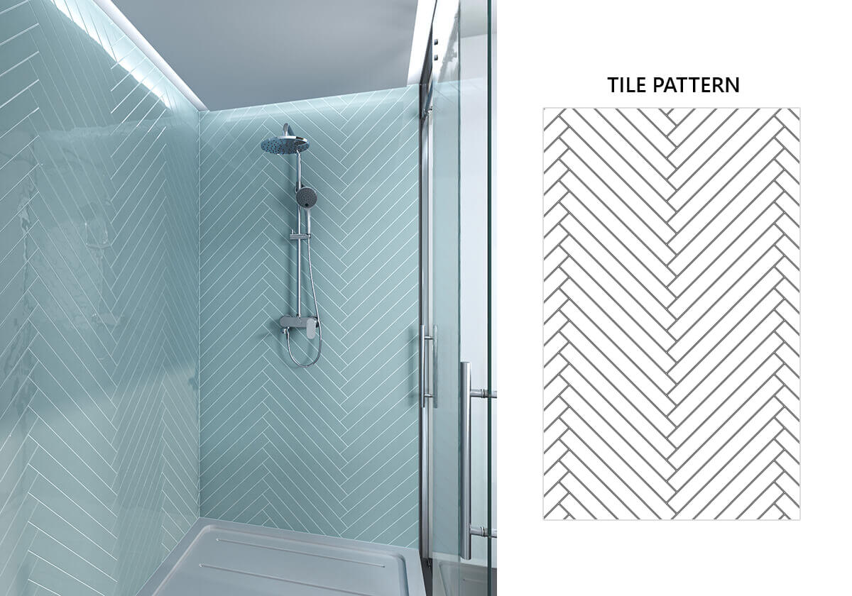
Another popular tile on the sophisticated herringbone pattern sees an elongation. It’s a very sophisticated look, with light blues and greens bringing the Art Deco and Art Nouveau interiors of yesteryear to mind. The picket shape will fit mid-century modern designs or shabby chic interiors alike.
Herringbone Straight
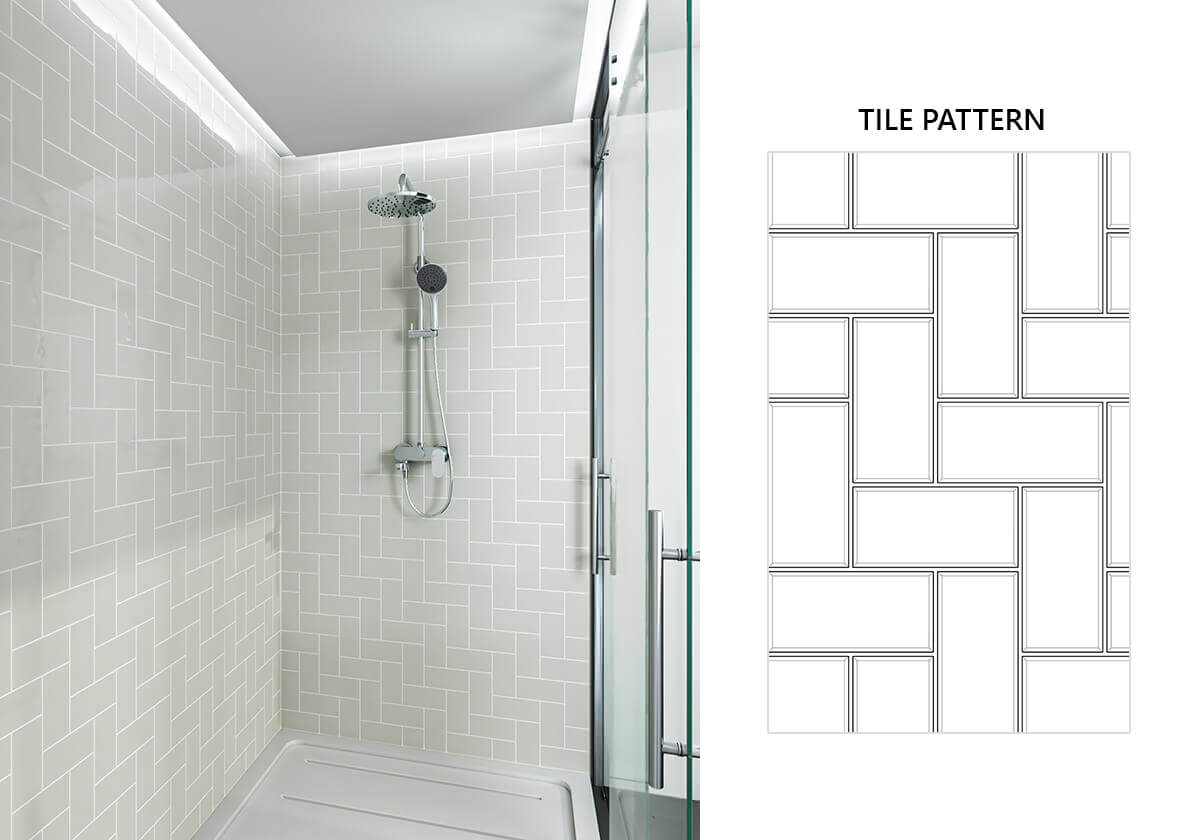
The clean, linear look of a herringbone straight pattern is a gorgeous way to showcase beautiful tiles. The pristine aspect of this design is part of why it’s so perfect for the bathroom and shower area, as it gives an immaculate sense of space.
Herringbone Traditional
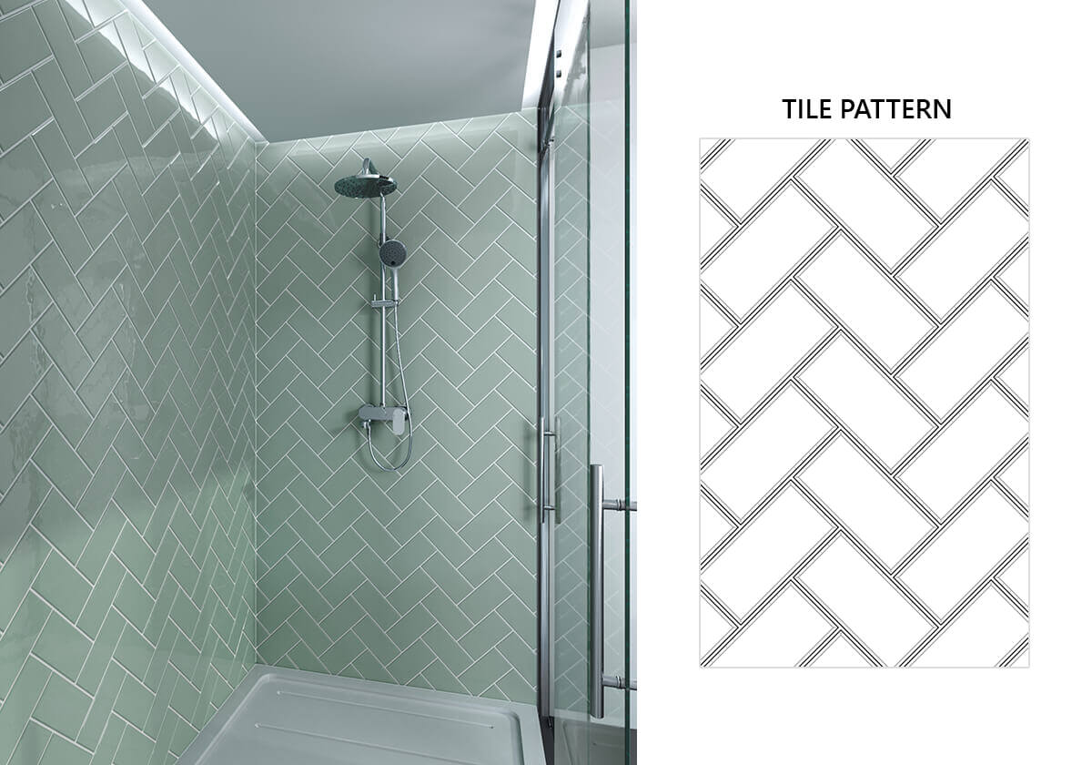
The main advantage of the herringbone traditional tiling layout is that it suits a range of different styles. In a more traditional bathroom, this layout will add visual detail because of the unusual pattern. And for more modern designers the subtlety brings a fantastic level of sophistication.
Offset Horizontal
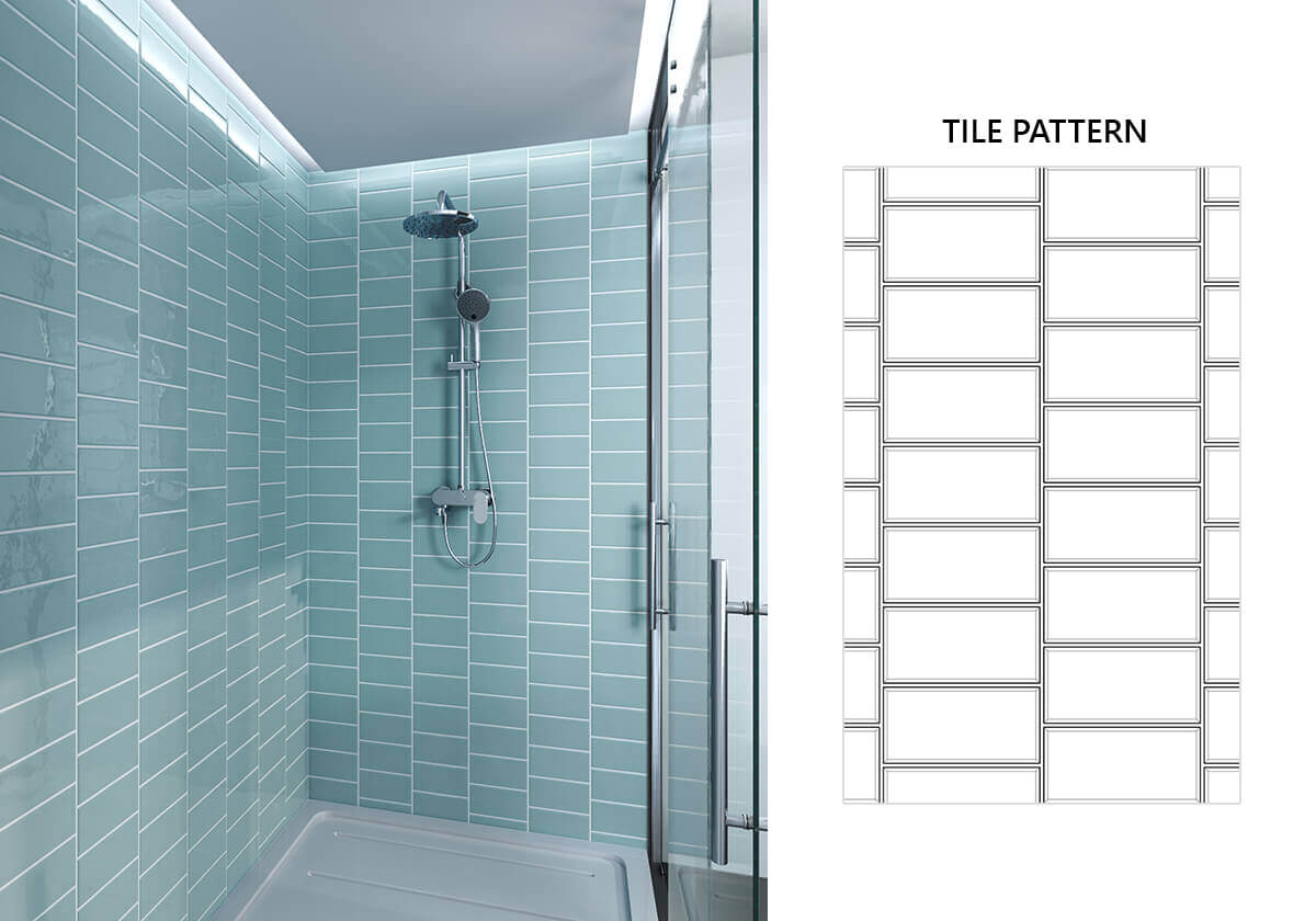
This pattern is a traditional look for good reason. The simple enhancement of offsetting your horizontally laid tiles gives the design as a whole a more appealing look. Installation imperfections aren’t the end of the world with this motif either and it adds flair without distracting from the focal point you’ve chosen.
Offset Vertical
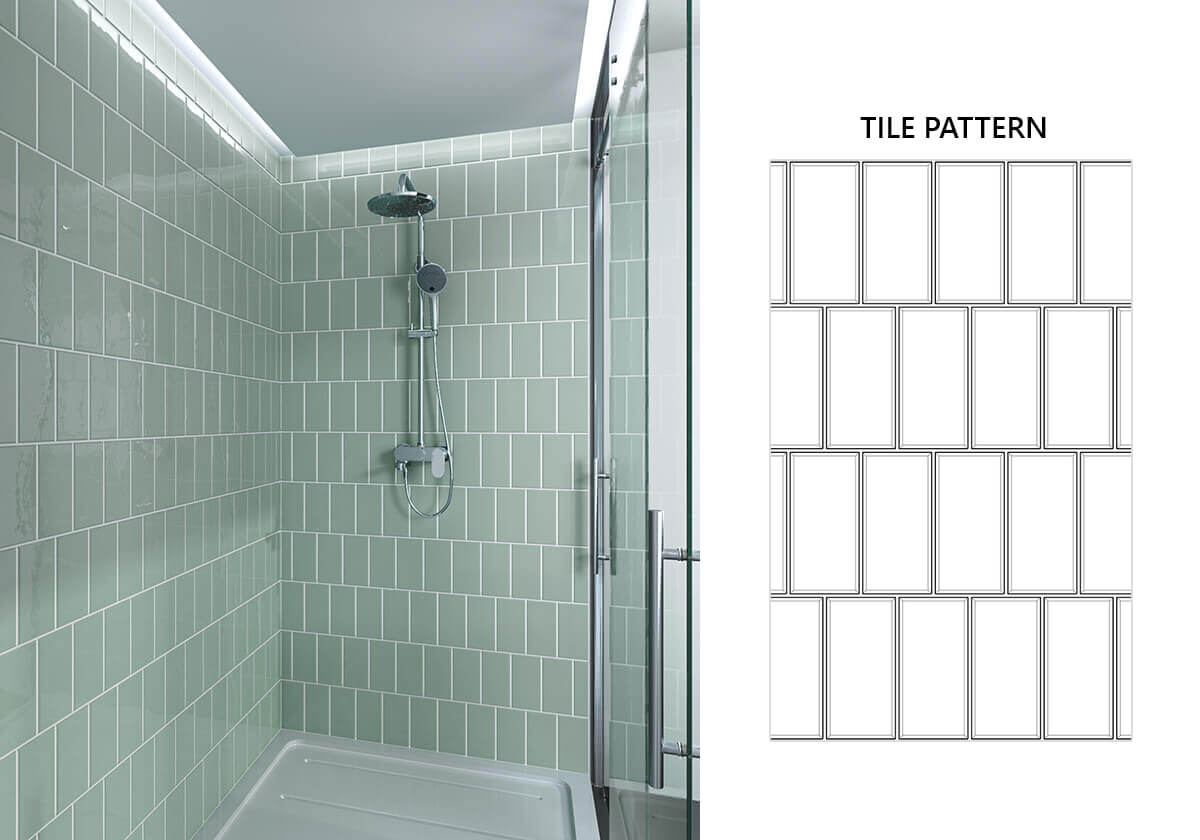
In this pattern subway tiles are stacked vertically but offset, giving the look a geometrical appeal on the quirky side. It will emphasize the height of your bathroom by making your walls seem taller and the area it’s placed in will suddenly take on new life.
Running Diagonal
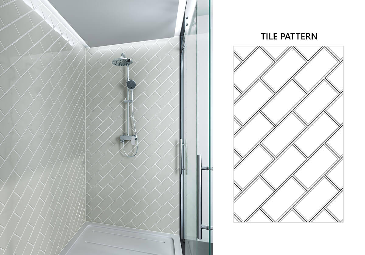
Running Diagonal patterns will open your bathroom up and give it a relaxed feel. Parallels and squares could make you feel like you’re entering a prison cell every time you use the bathroom! Diagonals offer you a feeling of extra space and running them gives the look a little vibrancy.
Running Traditional
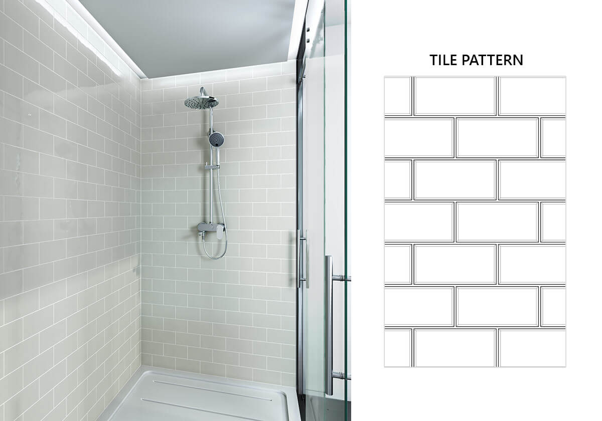
This is by far one of the most popular installation patterns for subway tiles. The design is very reminiscent of classic brickwork, composed of rows of tiles laid out horizontally. These are offset with staggered joints that offer a pleasing sense of symmetry and movement.
Running Variation
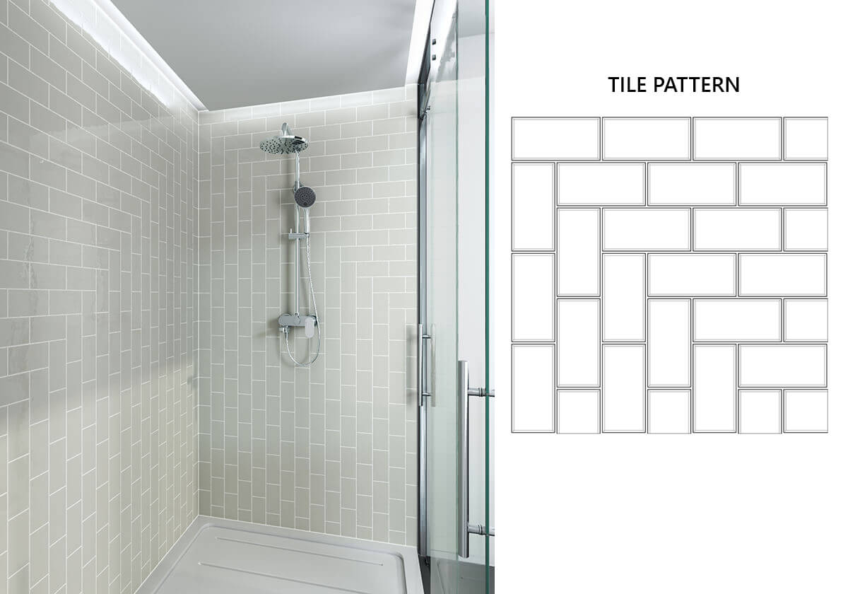
The running variation pattern works so well with showers because it’s very fluid. It’s a mix of vertical and horizontal tiles in a pleasing pattern that allows the eye to rove freely. The combination of upright and level tiles will enlarge the area they’re placed in.
Running Vertical
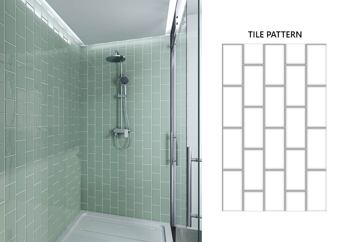
Vertically installed tiles give you the illusion of height, a wonderful trick in smaller spaces. And keeping the pattern at an offset ensures that you can retain the much-loved movement that the classic fitting offers. For more sophisticated spaces keep your colours light but consider darker hues if you want to add a bit of drama.
Running Dual
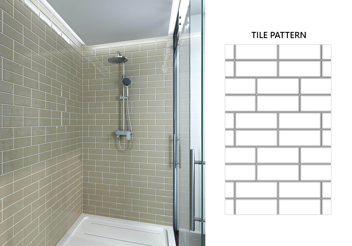
Patterns with multiple tiles can lend your bathroom a bit of artistic flair and you can keep things classic and elegant with lighter colours or soothe with darker ones. Combining different hues and patterns is also an option, but it’s best to stick to one in smaller areas.
Square Diamond
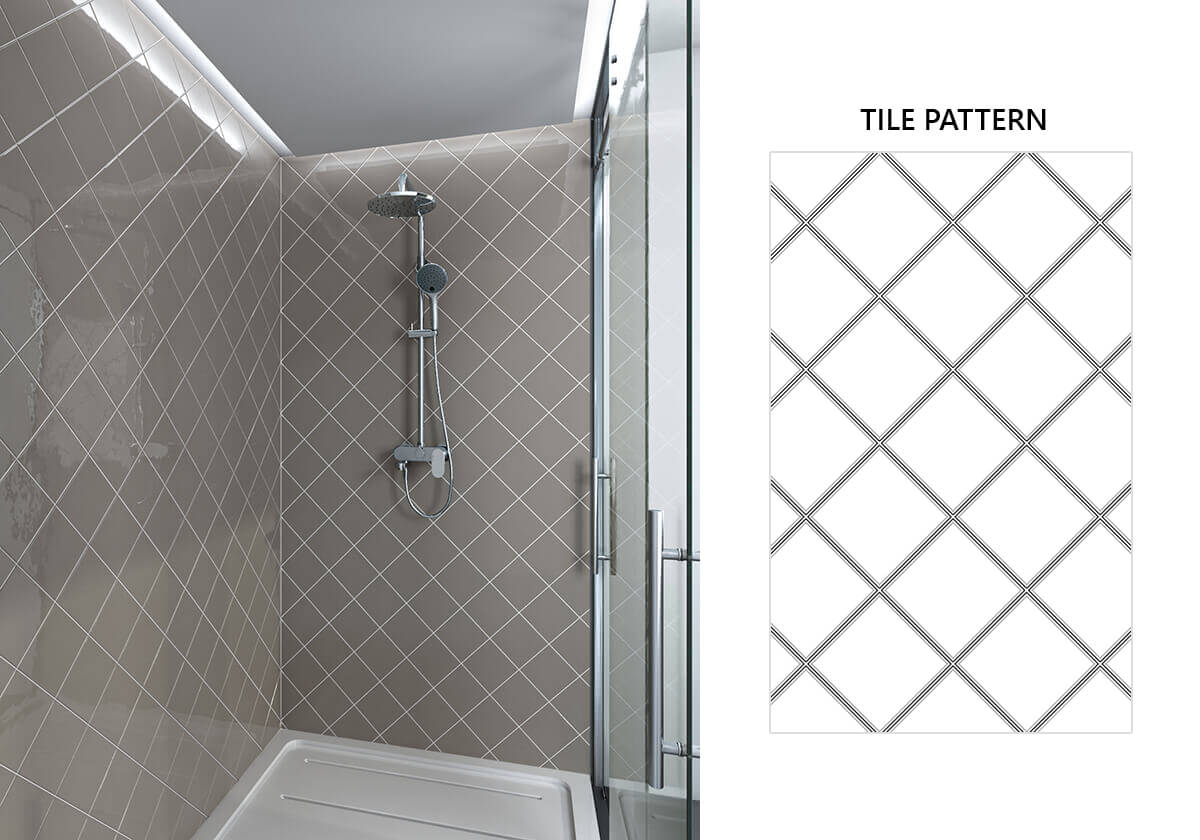
The square diamond subway tile pattern is a classic, with tiles rotated 45°. It’s simple but can have a very striking result and works perfectly as a centrepiece of some kind. Consider adding a unique border if you choose this pattern. It can serve wonderfully to draw attention to specific bathroom features.
Square Offset
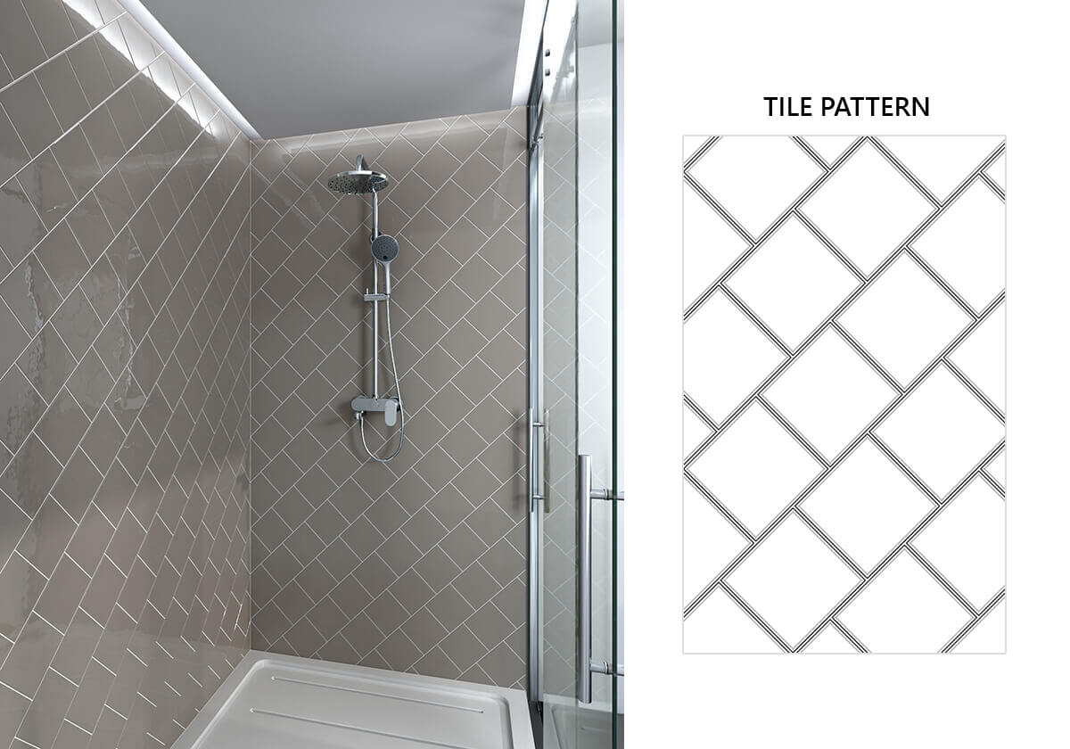
The square offset subway tile pattern adds a sense of movement, as most diagonal designs do. But its symmetry is soothing and has a calming effect on the mind’s eye, making it the perfect place to relax and unwind in a hot shower at the end of a long day.
Square Offset Horizontal

This pattern has a more traditional, classic feel, reminiscent of exterior brickwork. But being cut in squares instead of rectangles gives the design as a whole a feeling of whimsy and fancy. The clean outlines make it the perfect choice for a bathroom or shower design.
Square Offset Vertical
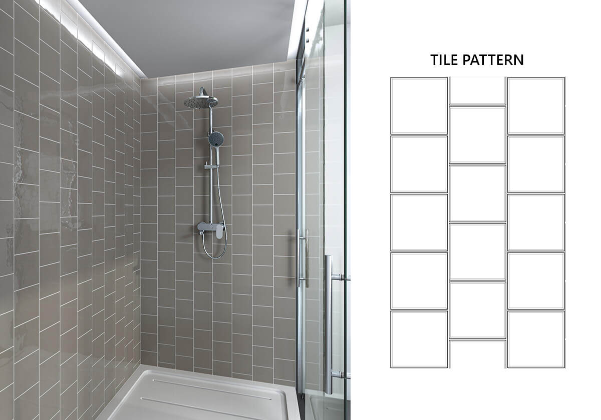
The vertical staggering of this version of the square offset has a laddering effect, extending the sense of height. The symmetry of this design makes it calming, so it’s a great choice for a bathroom or shower. This look is never going to go out of fashion!
Square Traditional
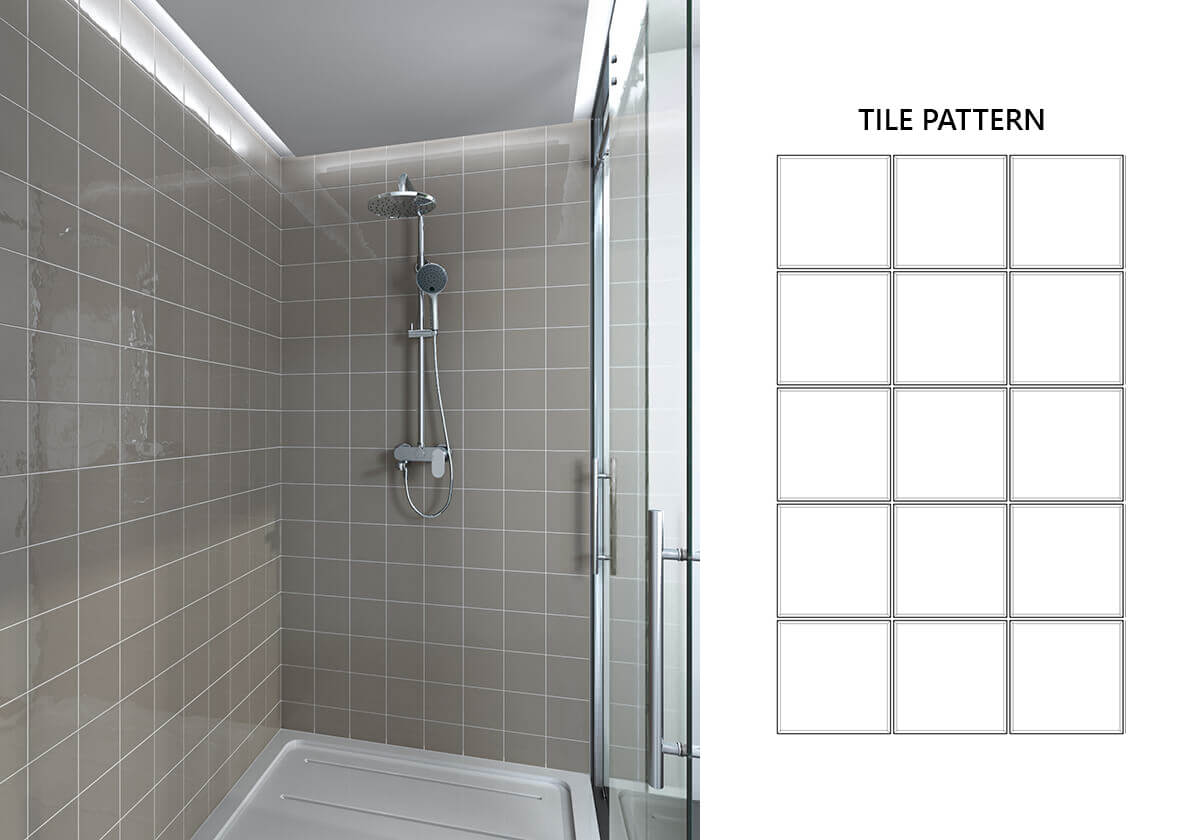
This time-honoured pattern brings an old-world charm to any home. It’s a design that provides a great setting for any colour that you choose and will highlight exceptional tiles by the simplicity of its pattern. Once again, you don’t have to worry about this look getting outdated because of the foundation it lays.
Stack Classic
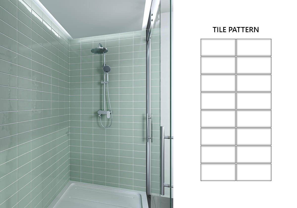
The rectangle shape used for the stack classic subway tile pattern has a utilitarian feel about it but by no means lessens its basic charm. The horizontal lines will elongate the space you choose to use them in and work to increase a sense of flow.
Stack Vertical
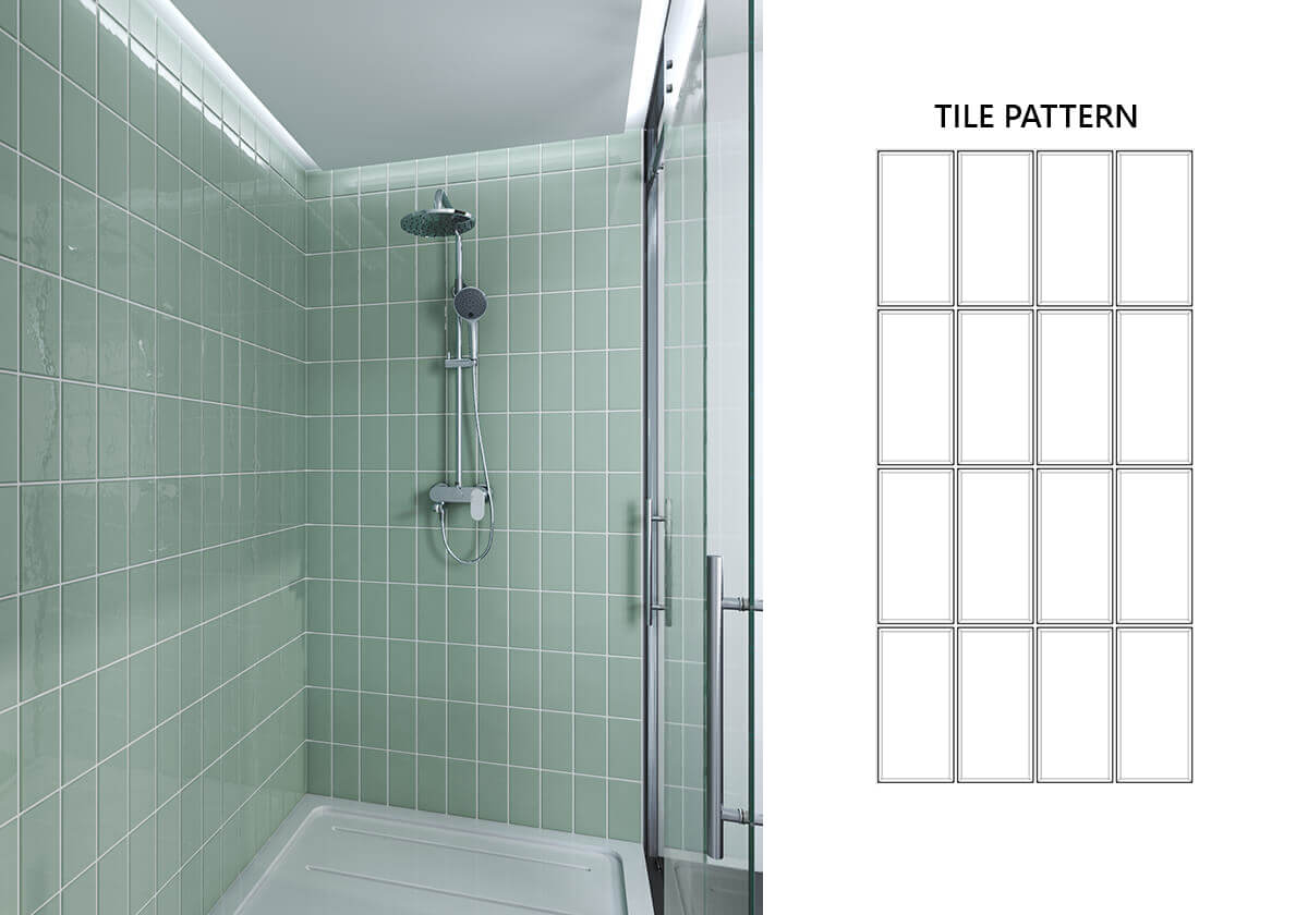
This style has a clinical feel to it, perfect for the ideas of hygiene and cleanliness you want your bathroom to convey. This can be contrasted with warm or cool tones, either of which can ensure a sense of homeliness, depending on other standout features in your bathroom.
Hexagon
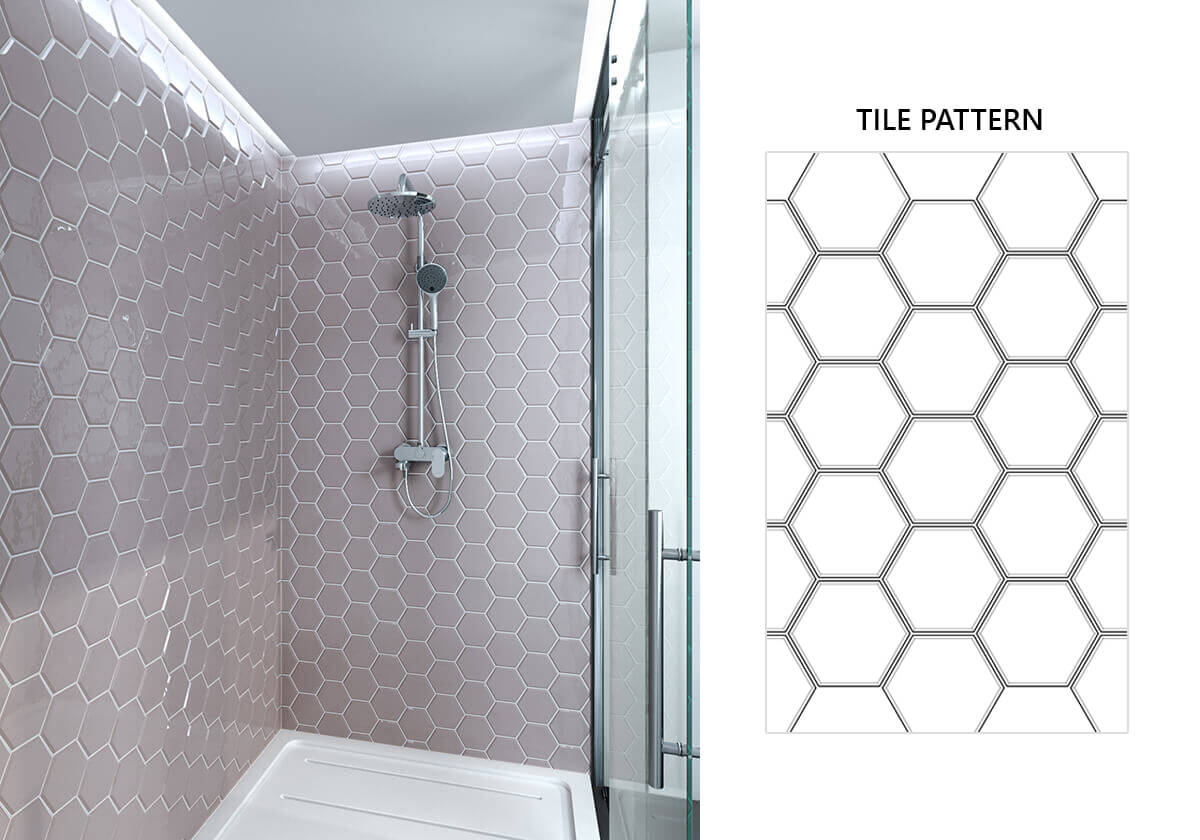
This energetic tile pattern has an organic quality to it and may bring to mind images of fish scales, perfect for the watery environs of your shower or bathroom. There’s a sense of movement dominant here which can be a wonderful contrast to cooler colour schemes in this part of your house.
Pinwheel Bond

You’ll be forgiven for getting ideas about your grandmother’s quilting designs when you look at this pattern. Its neatly interlocking aspects will give the overall space a boldness and geometry that will highlight both its colour and pattern simultaneously.
Pinwheel Dual

Vertical and horizontal tiles are laid within a repetitive square motif in the pinwheel dual pattern. This provides a counterbalance between stillness and movement which creates an ideal background for your bathroom or shower.
Pinwheel Variation1
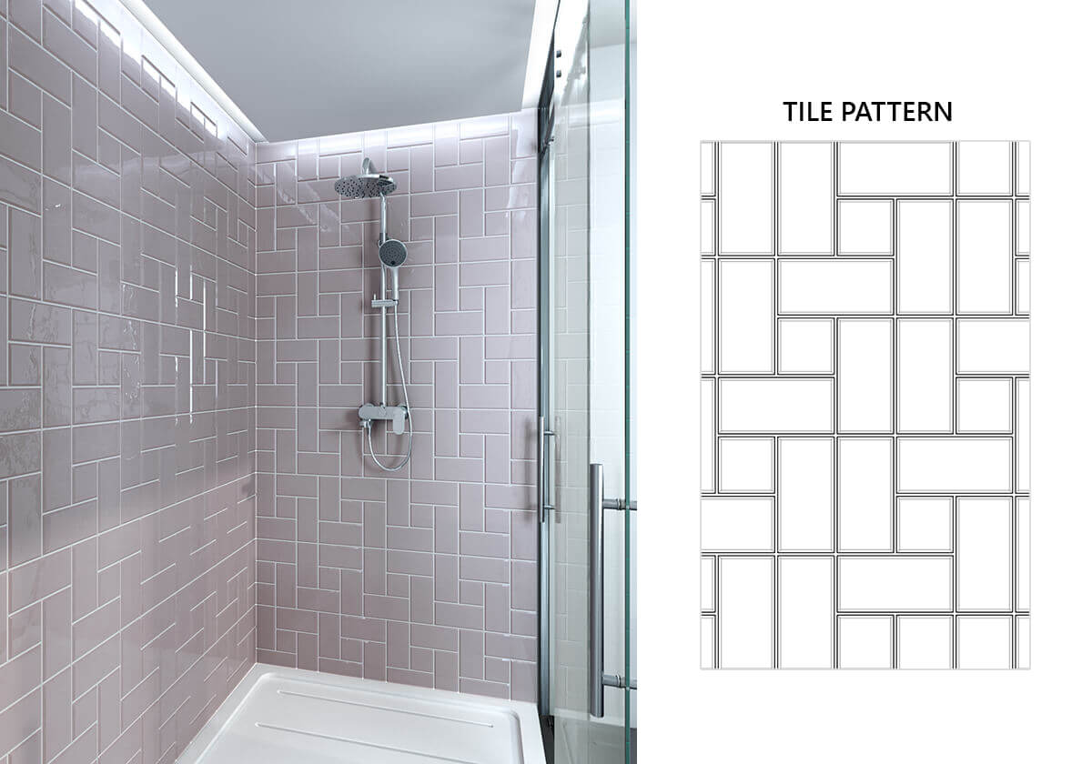
This pinwheel variation is a very fluid design which breaks the rigidity of the square pattern by having one tile always escaping the grid. It’s a very energetic look which can be diluted somewhat by opting for cooler tones in terms of colour.
Pinwheel Variation2
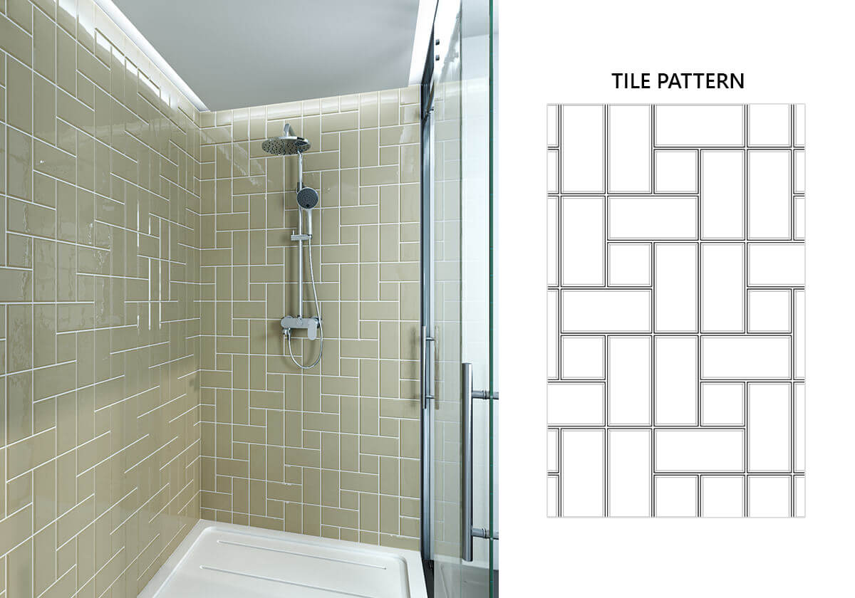
Reminiscent of the log cabin quilting pattern, this pinwheel variation motif is an elegant design. Tiles seem to run around the central square and create a wonderful sense of flow for the eye. It’s a calming pattern with its roots in a very old tradition.


